Patricia’s Patches 25, 26
from Virtual Quilter

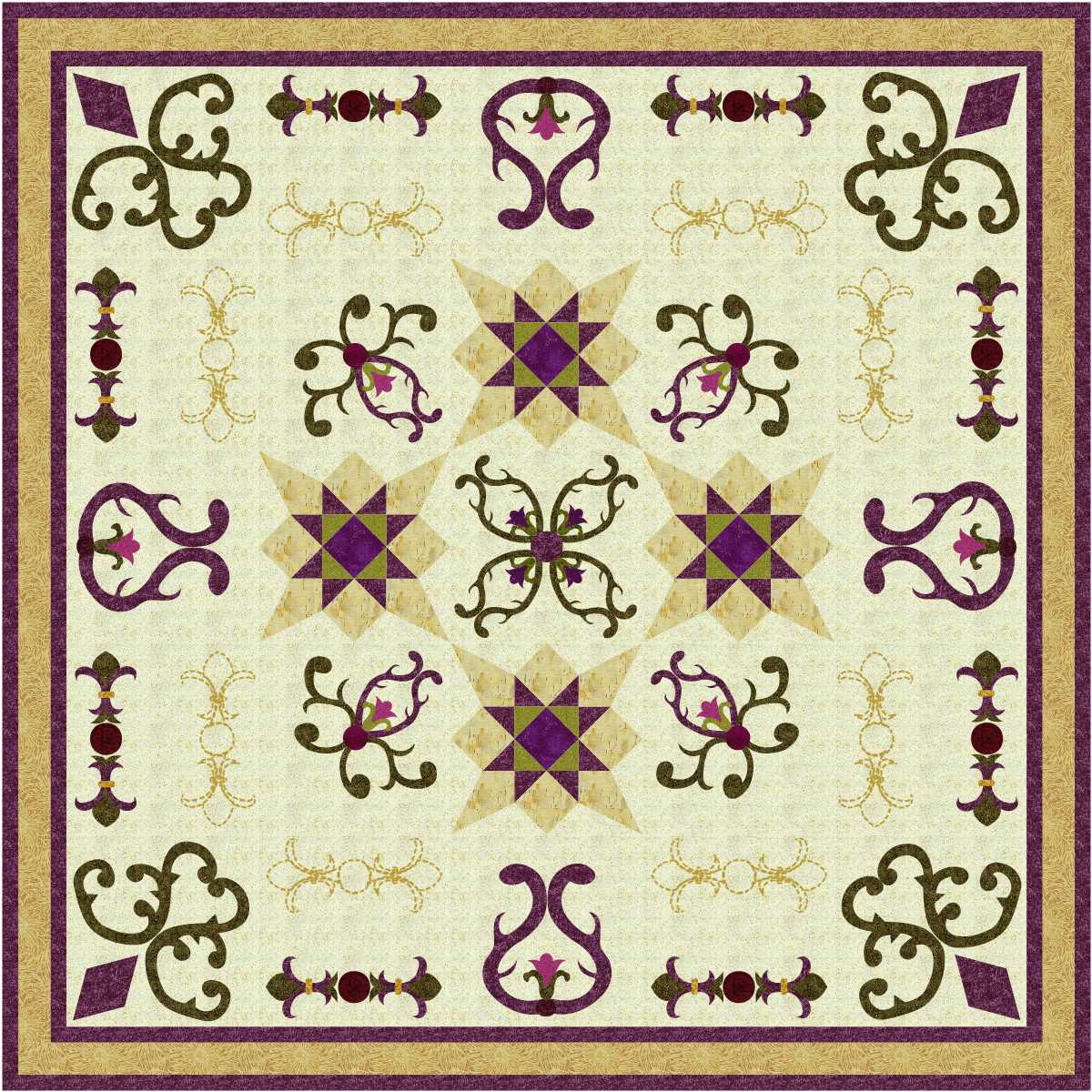
I like the first of today’s pair of designs.

However, the second one is my favourite of the pair.
read more
I like the first of today’s pair of designs.
However, the second one is my favourite of the pair.
read more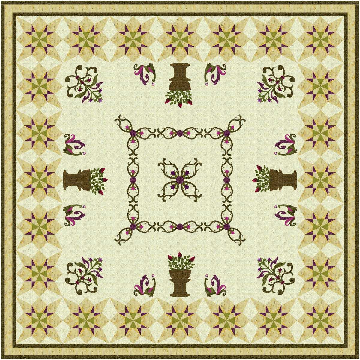
The blocks around the outside must be courtyard paving … would be great if we could get paving like that!
I love the peacocks.

Have to admit though that the paving looks better when there are some potted plants on it!
read more
On point setting, quilting motifs based on applique blocks filing empty spaces.

That’s the way I like to see quilts.
What I don’t like seeing are pieced and applique blocks quilted over with an unrelated motif which does nothing to show off the block designs.
read more
Love the first design.

Like the second one too. I like the border colours in the first more than the second.
read more
Very interesting applique designs create a very interesting quilt design mixed with pieced blocks.

Love the second design.
read more
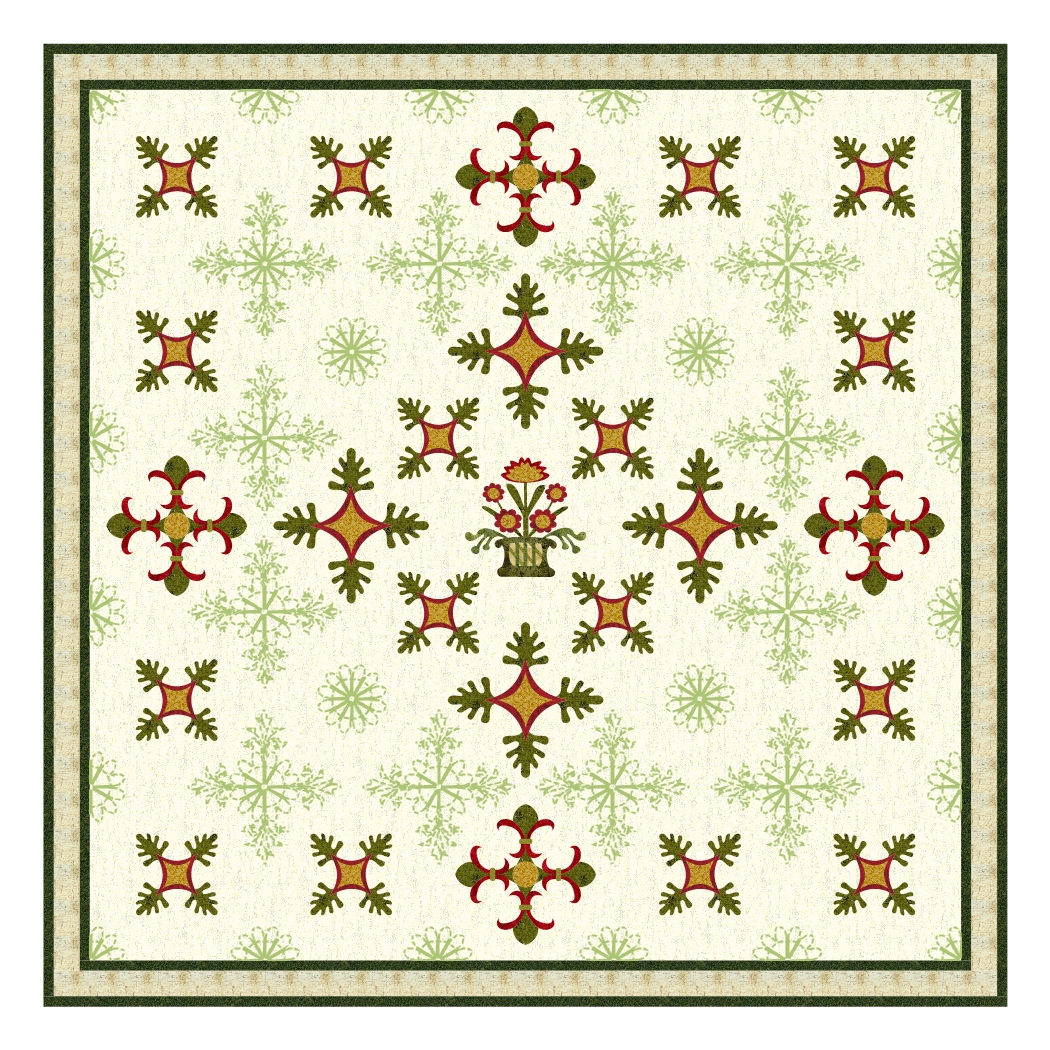
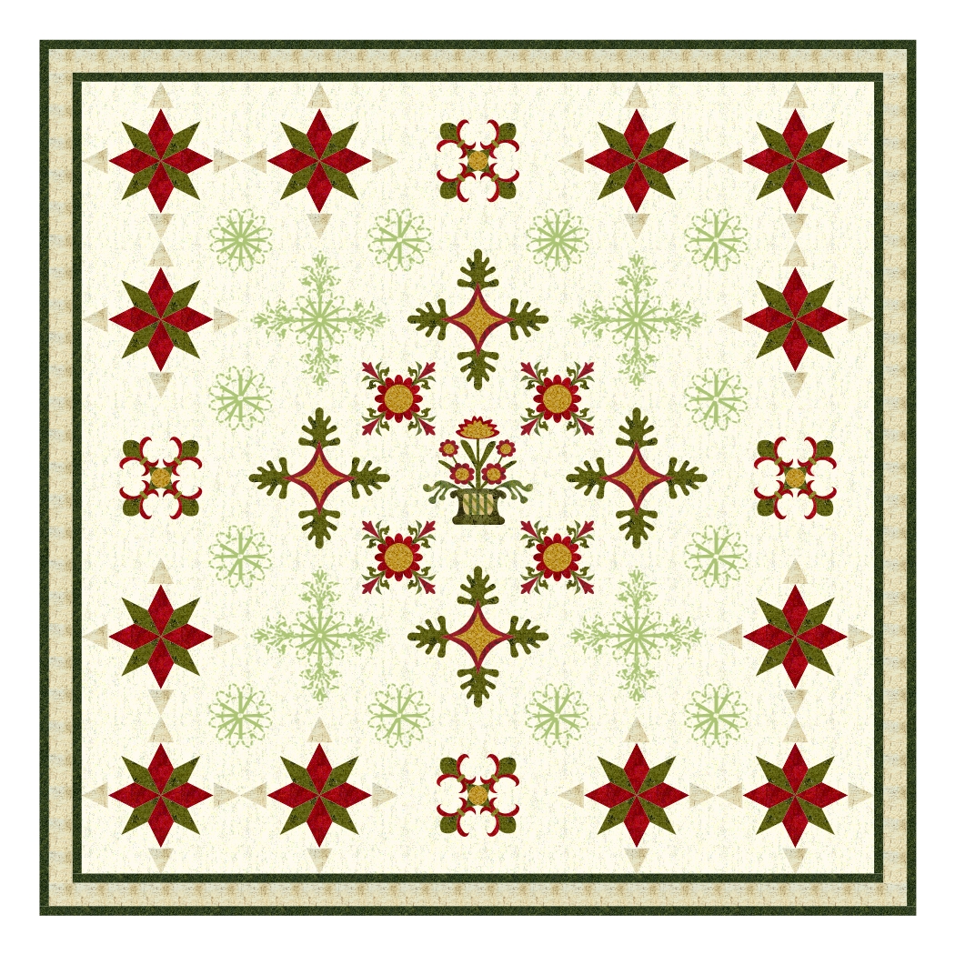
I love the first design!

This project file could almost double as a Christmas collection with the red, green and gold colour scheme.
read more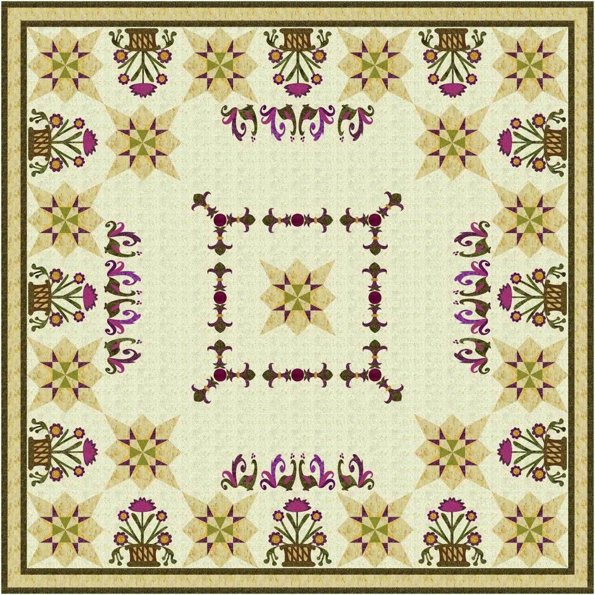
Interesting mix of pieced and applique blocks. Colours a re a bit dull, but I like them.

Like the second one better than the first … looks much fresher with that touch of green.
read more
Not my favourite colours, but I love the design.

Love that circle around the centre block!
read more
Very interesting.

I started designing quilts with assorted blocks, but repeating most of the assortment of designs. Most of the quilts I made before Electric Quilt came into my life were all different blocks, in other words sampler quilts. Doing the same block over and over for a single bed was boring, let alone doing a queen size one.
Since EQ came along I have mixed a few of one block design, a few of another, etc. until I had enough for the size needed. Sometimes there are a maximum of 16 repeats of one block, but neither of the ...
read more
There is space for quilting, so I like it!
More space for quilting, and some quilting motifs to fill some of that space.
This project file was started to tidy up the blocks used in other Patricia’s Patches series, but I couldn’t resist playing!
read more
Interesting.
Something I must do for real one day is to make a quilt with some low contrast blocks along with some with higher contrast.

Or perhaps I could just use the low contrast in parts of the blocks, not the whole block.
After all, I do quite a few designs with low contrast pieces in my virtual quilts.
read more